The Crunch Berry Run
Visual Identity • Logo Design • Motion Graphics
Murals & More • 2022
The Crunch Berry Run is an annual family-friendly color run and fundraiser benefiting Murals & More, a nonprofit supporting public art in Cedar Rapids, Iowa.
I developed a playful visual identity for the event inspired by the energy and nostalgia of Crunch Berries cereal. The identity was designed to appeal to families and children while remaining flexible enough to return year after year across digital marketing, print, apparel, and motion.
Design Challenges
The event needed an identity that felt more like a playful community experience than a traditional competitive 5K. The visual direction needed to appeal to families and children while drawing inspiration from the colorful, energetic world surrounding Crunch Berries.
The identity also needed to:
Feel playful and approachable without becoming difficult to read or reproduce
Reference the spirit of Crunch Berries while maintaining its own event identity
Avoid year-specific elements so the branding could be reused for future events
Translate effectively across digital marketing, printed materials, apparel, and motion
Developing the Identity
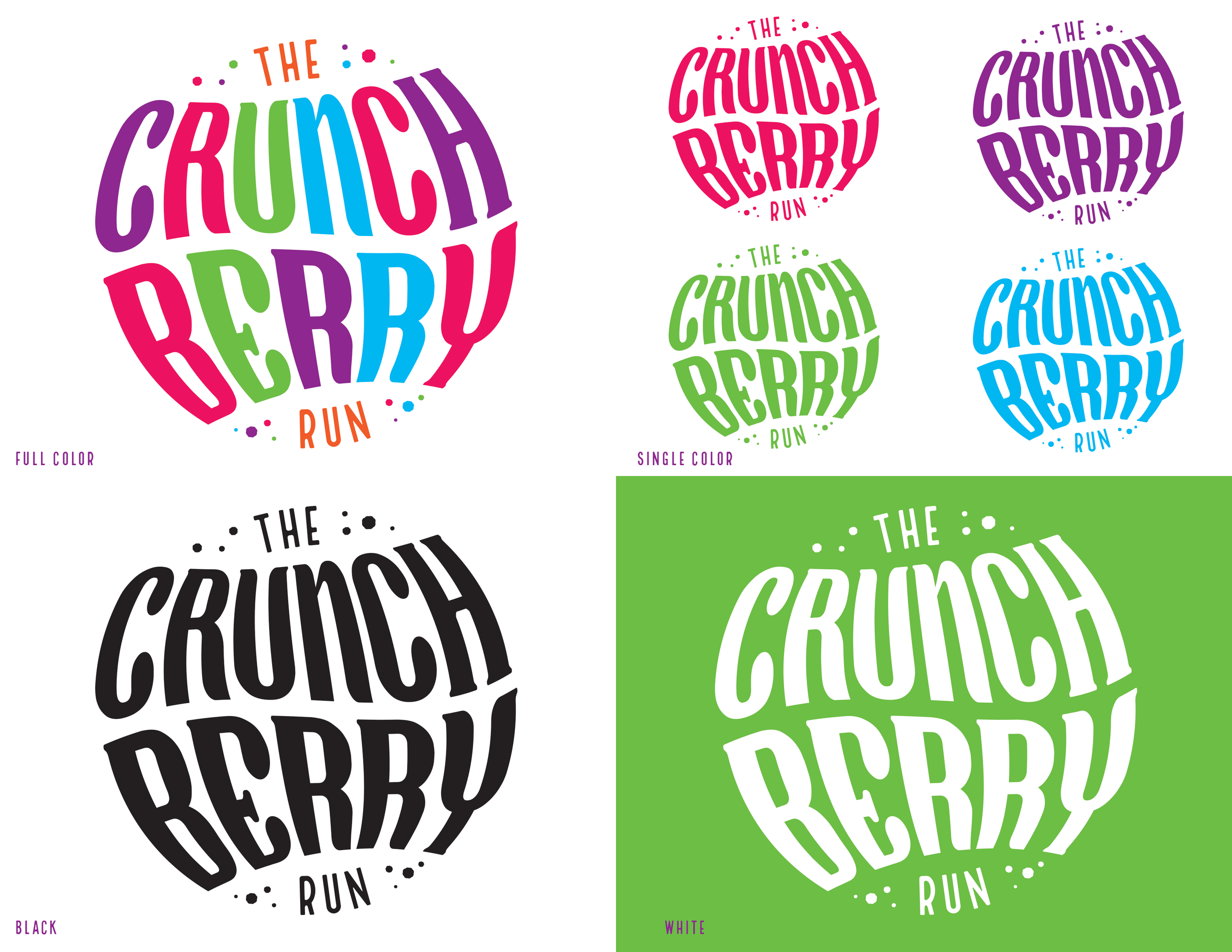
The playful theme immediately led me toward expressive, warped typography as the foundation for the logo. I wanted the letterforms themselves to feel energetic and slightly unexpected, capturing the fun of the event before any additional graphic elements were introduced.
The concept came together quickly, allowing me to focus on refining the custom typographic treatment, color, and composition into a distinctive identity that could remain recognizable across different applications.
Bringing the Identity to Life
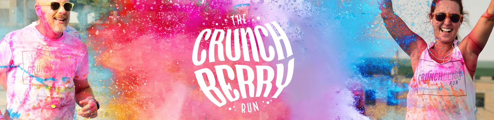
I extended the logo into motion with a custom animation that builds on the energy and movement already present in the typography, creating an additional branded asset for digital promotion.